The Brief
YoungArts fosters young artistic talent across the United States through a mentorship program with acclaimed artists like Frank Gehry and Jeff Koons. In an effort to provide support for these young artists, I designed a social network that allowed their alumni to stay connected long after their mentorship programs had finished.
Initial Concepting
During initial kickoff, I spent time at the whiteboard with the YoungArts team sketching ideas for the primary flows of the app. This was helpful in aligning our teams, setting expectations, and getting a rapid start on the project.

Wireframing
I created a set of high-fidelity wireframes for primary flows through the app, including logging in and using the content creator. Planning up front for these small, delightful moments are one reason I like high fidelity wires for the right project. The following screen shows the UI when a user follows an invitation link from their email, highlighting the user’s appropriate discipline in the illustration at right.

In this example, a dance alumni is signing into the app for the first time.
Home Base
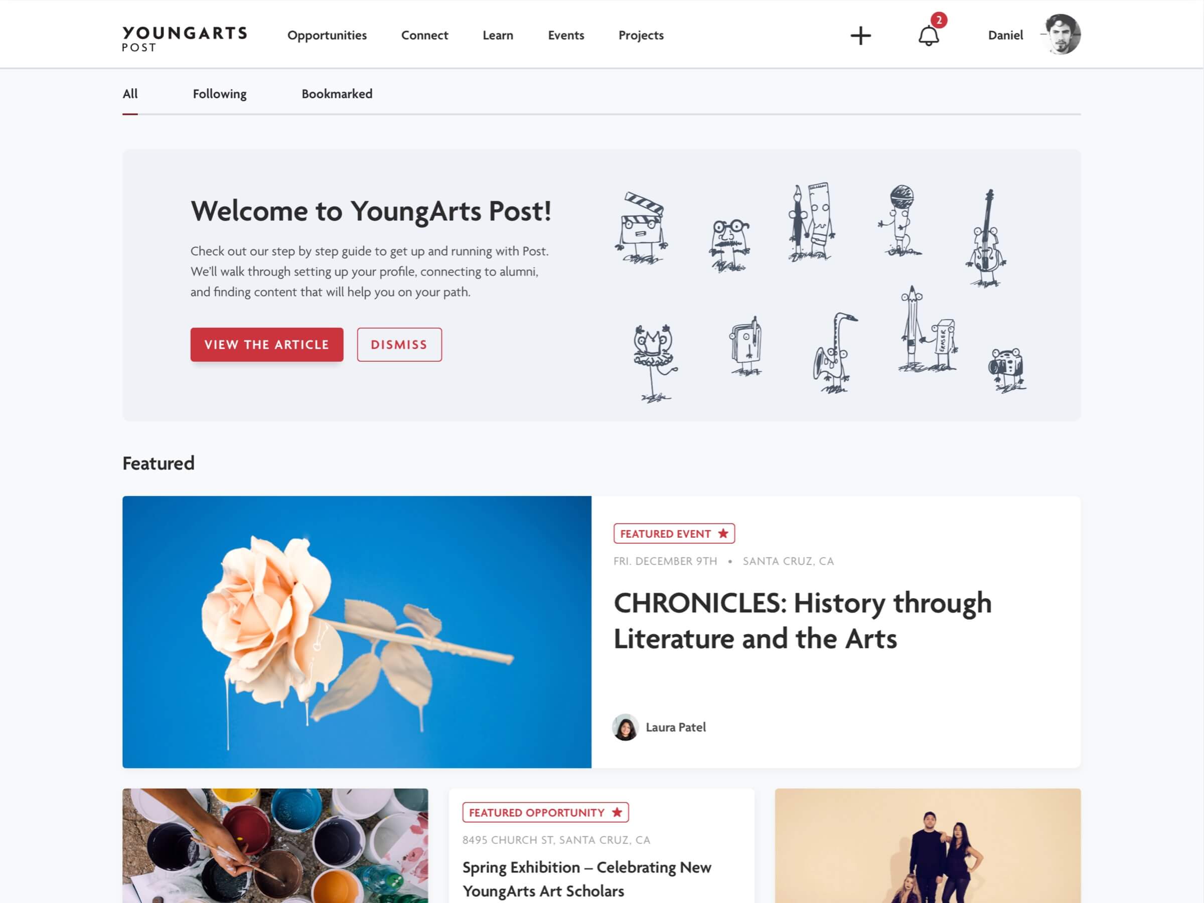
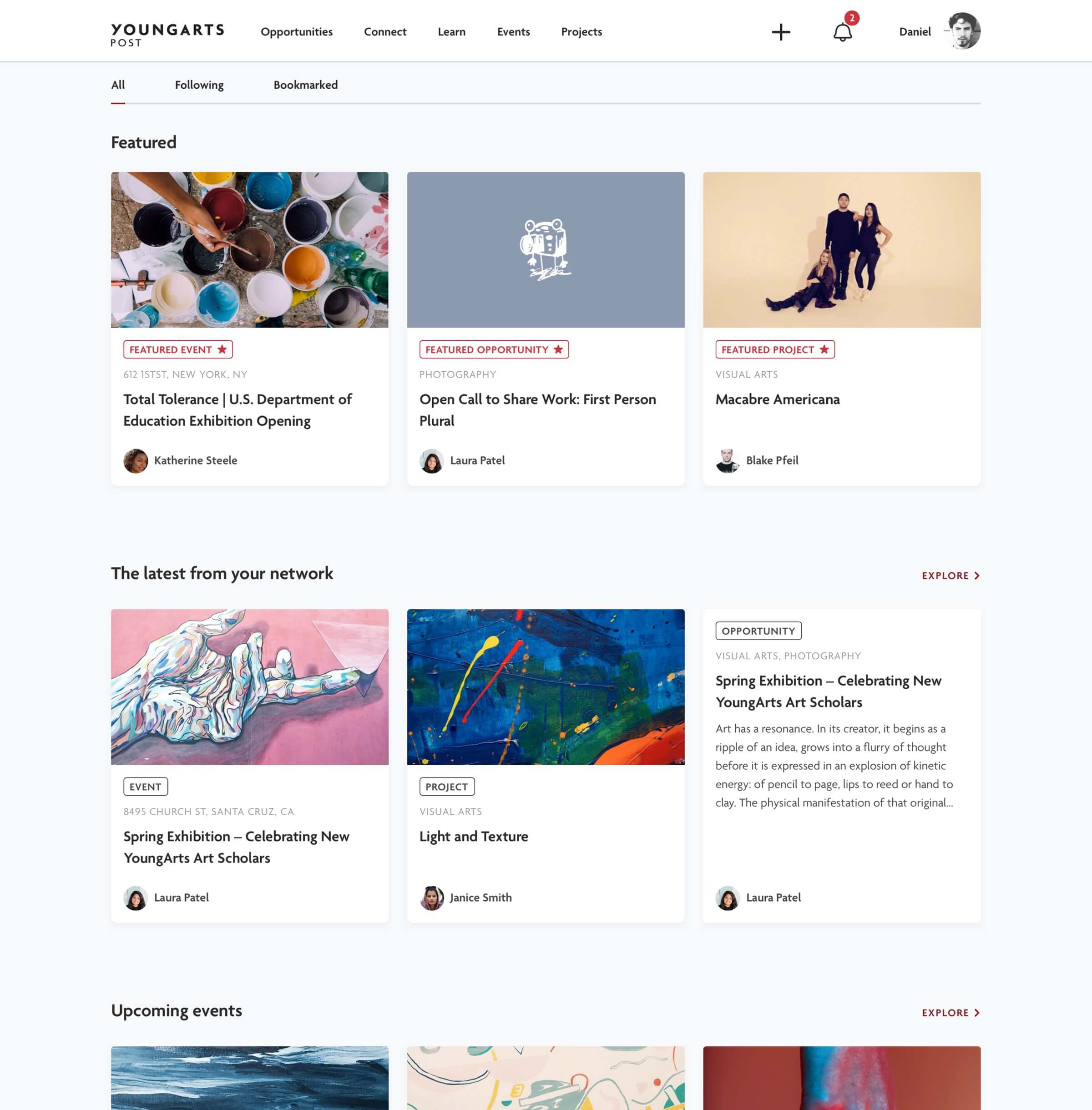
The home screen surfaces relevant content for each user. The YoungArts team has the ability to feature all types of content, from opportunities to member projects. Each section of the home screen is curated for the user, and provides an "explore" CTA to dive deeper into each content type.
Connect
I designed the Connect screen to have intuitive filters to help alumni find who they want to connect with. Individual profile pages give alumni a place to show their work, talk about their artistic goals, and share events/opportunites that they've created. Many of the young artists in the program don't have the resources to have a full-fledged portfolio website, so this gave them a spot to post work to their peers.


Single Pages
Single pages (single event shown below) were built out as flexible templates for the YoungArts team. I designed the skeleton of each content type to have the appropriate information, and then the body is built out with a robust content builder.

Mobile Content Creation
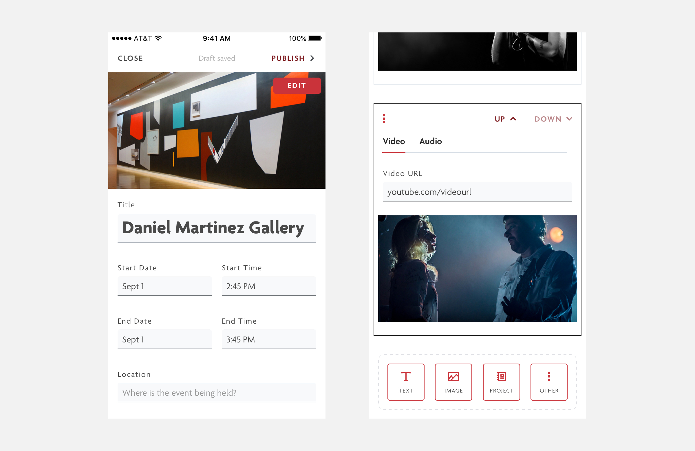
Given the target audience of the application, creating content on the go had to be quick and easy.
Mobile Focused
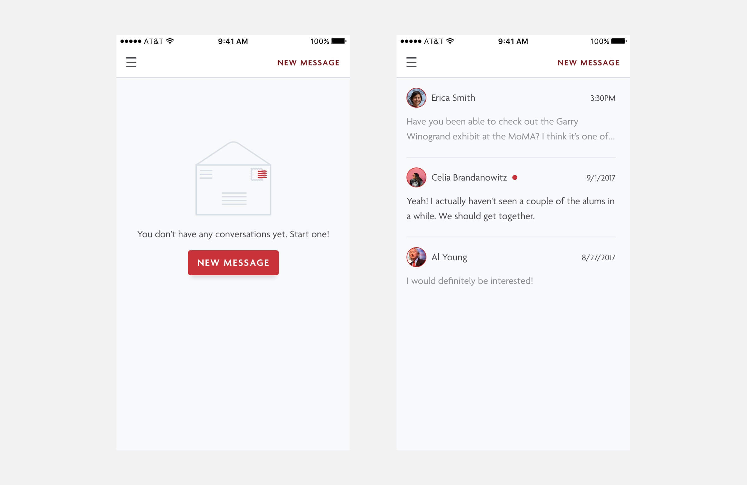
Although messaging didn't make it into the MVP, I designed a messaging section for the application. Extra care was taken with mobile filtering to make sure that experience scaled down well.

A Custom CMS for the Staff
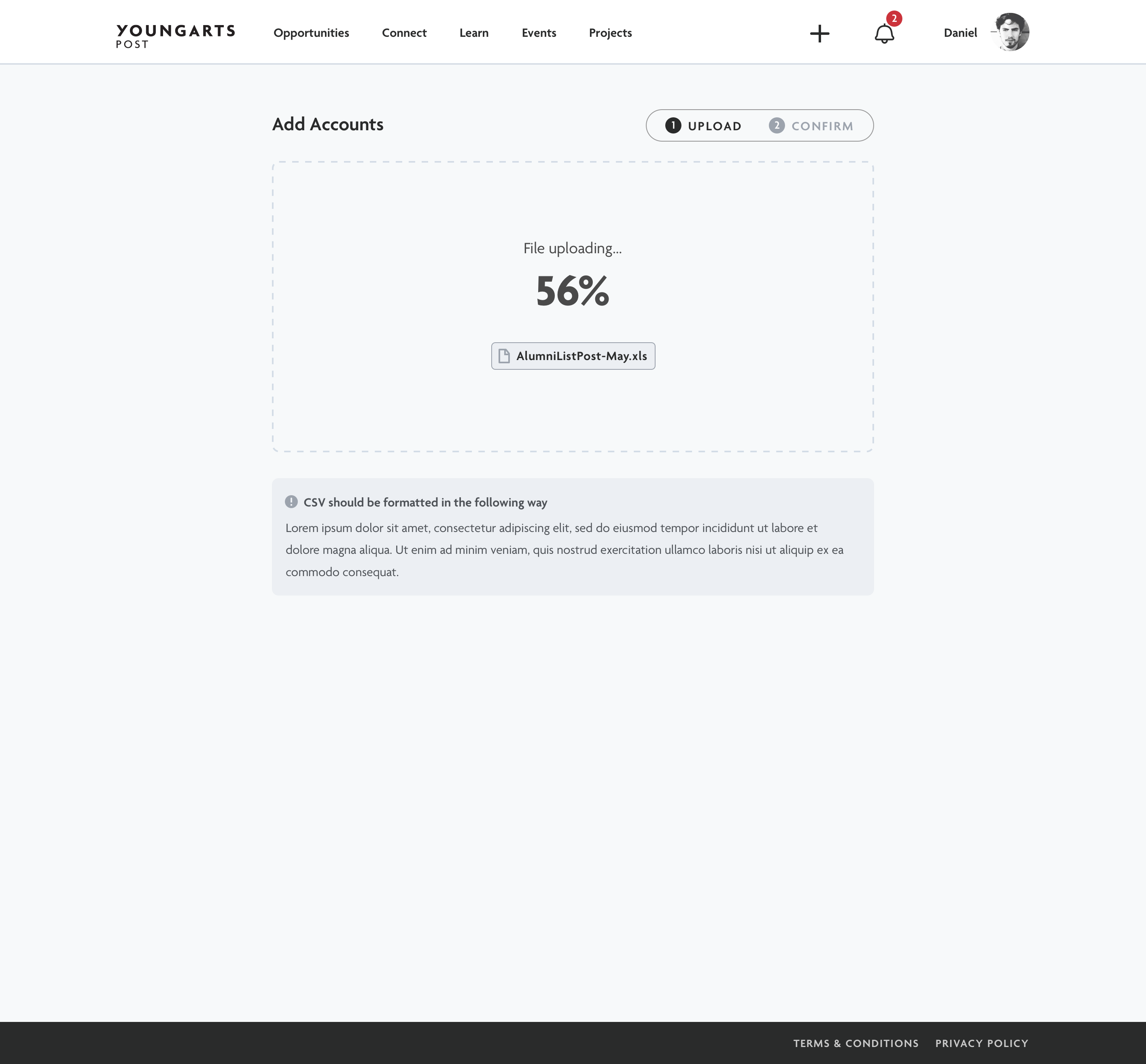
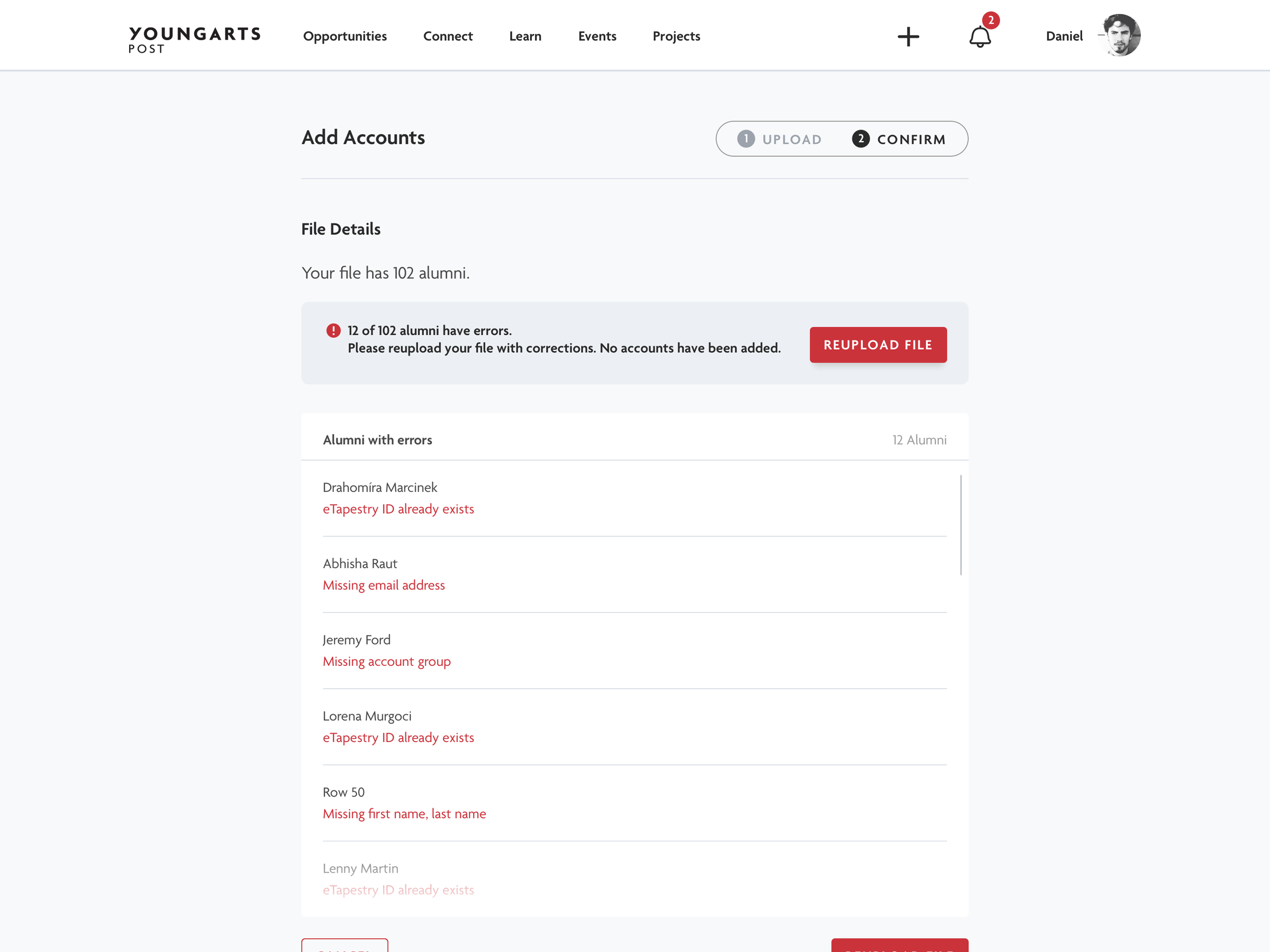
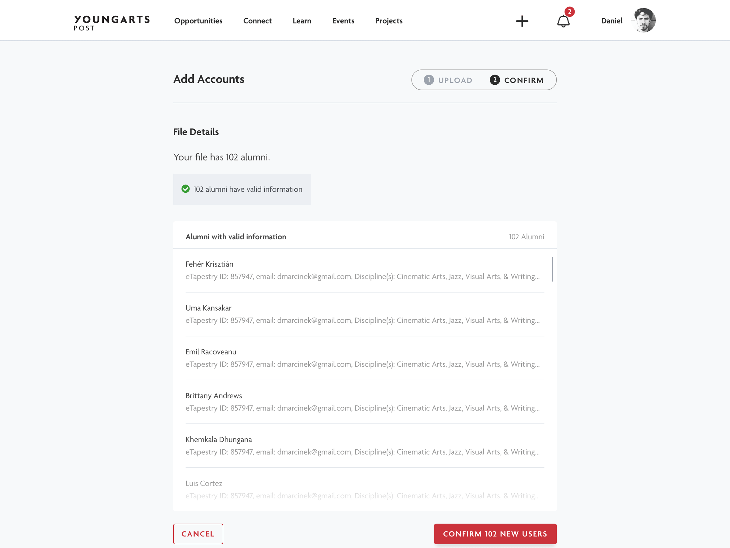
One friction point with the initial build of the platform was that uploading many users was becoming tiresome for the staff. I helped design a bulk uploader to make it not only a faster process, but one that was fault tolerant and helped keep their users organized.
Click through to see the flow of uploading a group of users.
Styleguide
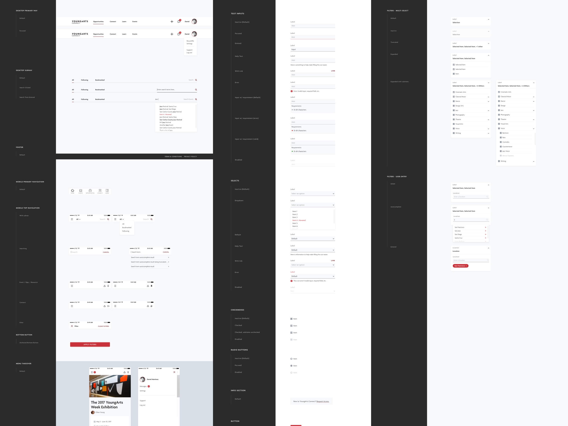
I built an extensive styleguide for the app that included all interactive components and their various states. This helped me ensure we had all of the necessary functionality, helped the developers write code without having to guess, and provided a library of components to reference and build from.
